Simple A/B Testing
True improvements to user journeys only come from understanding where and what people are looking for on your website. When designing a website it can be a balancing act between giving what stakeholders want (and need) and giving recommendations around what you might believe to be the best user experience on a website.
Ecommerce websites offer very obvious ways to track an effective journey, and from a business point of view an easy bottom line variable – do users add products to the cart?
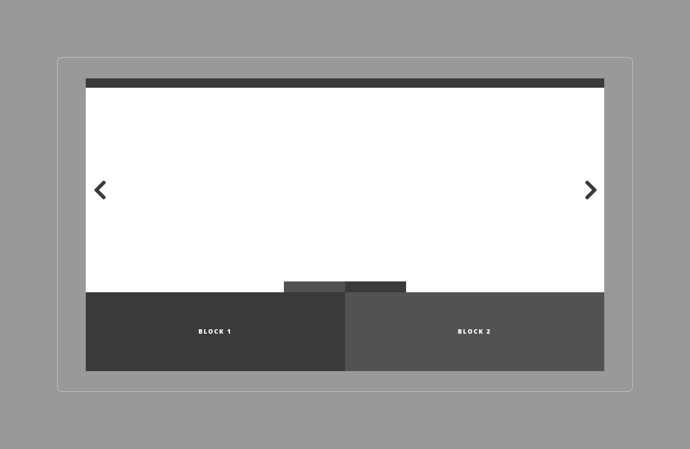
A website I work on has two large CTA areas on there homepage, essentially large buttons to start a journey through the website.

The initial content in these areas was determined in consultation with the business for the initial release of the website.
Simply looking at the most visited pages over the course of the first month, I set up a Google Optimize A/B test replacing this content with links (and descriptions) of the two most visited product sections of the site.
After collecting data (targeting 10% of traffic and gaining roughly 1500 sessions each) the new content resulted in doubling the likelihood of users adding to cart. You can’t argue with real-world data.
Testing doesn’t have to complicated, just taking a very basic look at what users are looking at (or for) on your website and making use of the layout of your existing website can have dramatic impacts on user progression.