

The CSS selector for vertical height (for example width:100vh for a full height div) offers a super easy way to setup beautiful full-width and full-height div blocks for images or sliders.
However, an issue arises on mobile devices when you start scrolling the vertical-height changes as you scroll due to the nav-bars disappearing.
To overcome this you can add a few media queries targeting as many devices specifically as you’d like:
Disclosure, I found this online… but can’t remember where I did so, posting it here for me to remember the trick.
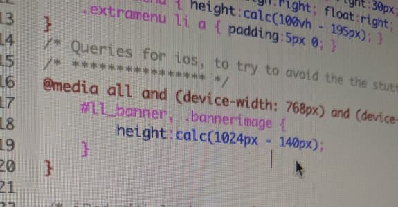
/* Queries for ios, to try to avoid the the stutter - specifically ios */
/* **************** */
@media all and (device-width: 768px) and (device-height: 1024px) and (orientation:portrait) {
    #banner, .bannerimage {
        height:calc(1024px - 140px);
    }
}

/* iPad with landscape orientation. */
@media all and (device-width: 768px) and (device-height: 1024px) and (orientation:landscape) {
    #banner, .bannerimage {
        height:calc(768px - 140px);
    }
}

/* iPhone 5
You can also target devices with aspect ratio. */
@media screen and (device-aspect-ratio: 40/71) {
    #banner, .bannerimage {
        height:calc(500px - 140px);
    }
}