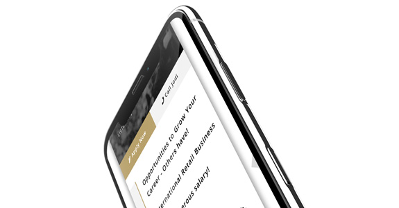
Using the classic burger menu is the accepted means of hiding a sites menu on mobile devices (or even on desktop to create a cleaner look). The typical approach would be for the top logo/burger menu to attach to the top of the screen and follow the user as they scrolled. This does however take up screen realestate which can be at a premium on smaller devices.
On news apps you can usually slide/swipe in from the right or left to access the sites menu.
In a new design I’m currently working on for the The Switch Agency I’m trying to combine both with a subtle arrow that sits on the right of the screen midway down. This offers the user an obvious directive – the arrow is pointing in the direction the menu will slide out. Whilst it’s the arrow is subtle, it does draw the eye as you scroll as its the only static part on the screen which draws the user to explore/tap/click it.
In this instance I’m pairing it with a scrollTop animation as the menu is placed at the top of the screen. I could alter it to be fixed which would allow it enter from the point the user is at but I like the extra animation of up & left – particularly on desktop.
Check out the screencast below to see it in action.

