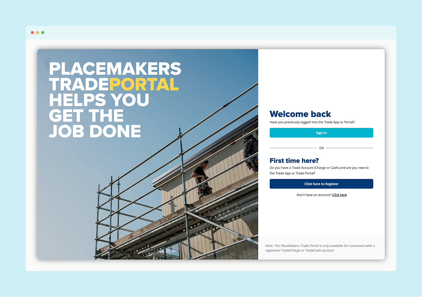
As part of ongoing efforts to improve user experience across the TradePortal, I recently updated the login screen to make it more intuitive, welcoming, and aligned with the overall visual direction of the platform.
UX Improvements:
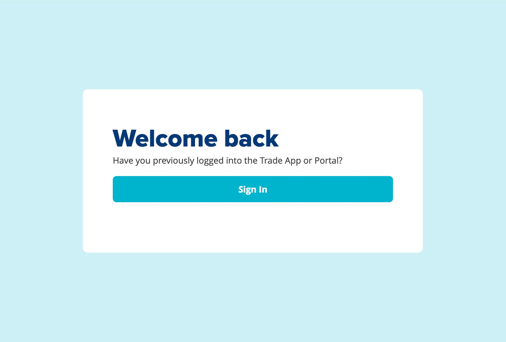
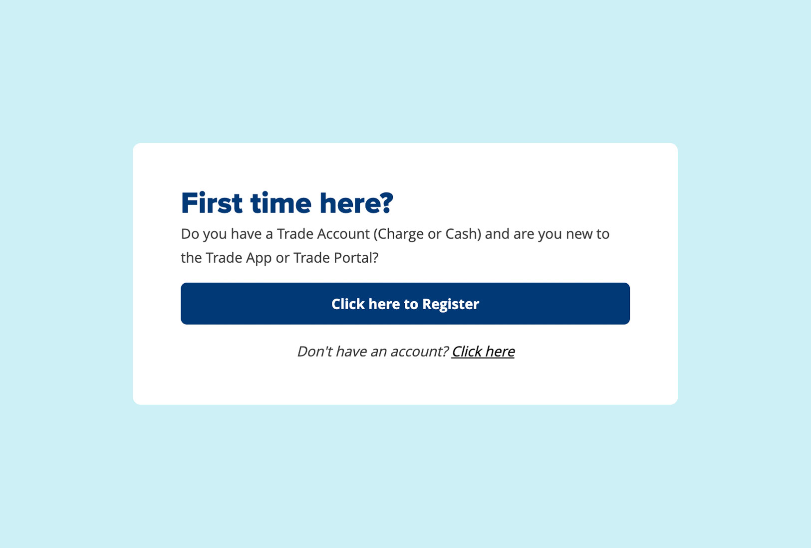
Improved clarity by separating key actions (returning login vs new account setup) and presenting them in a logical, user-first order.
Reorganised content structure to create a clearer user journey, distinguishing between returning users and first-time visitors.
Refined messaging to be more conversational and directional, helping users quickly identify the next step based on their account status.
Alongside the UX the visual design of the login screen was modernised to align with the broader TradePortal interface, featuring updated typography, improved spacing, and clearer layout. The goal of these changes is to enhance readability, establish stronger visual hierarchy, and provide a cleaner, more user-friendly experience.